
CMYK, RGB, & Spot Colors
What is the difference, and why does it matter?
I’ve found myself explaining to clients why their business cards won’t look as bright as the colors on their computer monitor (if printed in CYMK) or why it’ll be hard to match that color from their brochure perfectly on their website. Many things come into play, including monitor make, monitor model, and screen brightness, but usually, it boils down to the inherent differences between print and digital media. Hopefully, this will clear some of that confusion up.
There are two major types of media. Most things you interact within your day to day fit into one of these two categories.
- Print – Anything physically printed on a material surface
- Digital – Anything shown on a screen, monitor or projected screen (not on paper)
What type of things fit into these two categories?
- Newspapers
- Magazines
- Packaging
- Books
- Brochures
- Business Cards
- Folders
- Annual Reports
- Maps
- Banners
- Signs
- Billboards
- Flyers
- Posters
- White Papers
- Menus
- Signage
- Mailers
- Etc…
Digital (anything viewable on your…)
- Phone
- Computer
- Tablet
- TV
- Digital Billboards / Signs
- Digital Kiosks and ATMs
Since print media has been around much longer than digital media, let’s start there.
Pick up a glossy fashion magazine with stunning photos, a local newspaper on the street corner, or a bright flashy mailer sent to your door…there’s a very good chance it’s been printed using nothing more than 4 ink colors. How is it possible to get just about every color needed out of 4 colors?
Welcome to the world of CMYK printing.
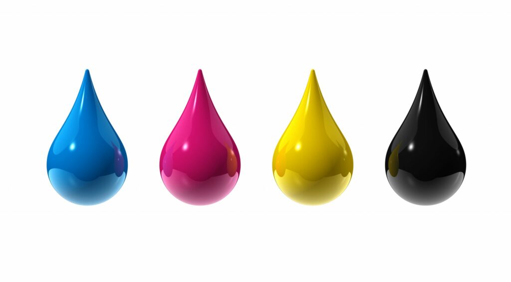
CMYK is actually an acronym where each letter represents one of the ink colors that are used.
C – Cyan
M – Magenta
Y – Yellow
K – Black (Black used to be called “Key” in print shops. Hence the “K”.)
This is also often called “Four Color Process” printing.
How do these 4 colors work together to create almost any other color?
When you print with extremely small dots, and varying amounts of transparent ink, you can create just about any color. The dots are so tiny that the eye blends the colors together.
Let’s take a look at the image below. If you look at the left side of that image, you can see that it looks like a typical photograph. If you look at the image on the right (zoomed in very closely), you’ll see that the detail of the eye illustrates the use of tiny dots to make up this image. This was printed using nothing but the colors cyan, magenta, yellow and black.

Now that we have a good idea of how 4 color process printing is done, let’s quickly touch on what “Spot Color Printing” is.
Spot Color/Spot Printing/Offset Printing
These are all terms for printing pure, hand-selected colors, one color at a time, not trying to blend them like in realistic photos that use CMYK printing. This method is typically more affordable since professional printers (not to be confused with a printer in your home or office) often charge on a per-ink basis.

Above are 3 posters using spot printing. As you can see, they tend to be bright, visual, and have flat colors. You can still use screens to create gradations, but spot printing can be an excellent choice when trying to make an exciting visual impact.
Let’s say you want to print your company business cards, folders, and brochures, but have three very specific corporate colors. Deep red, bright orange, and fluorescent purple (that would be pretty heinous), and no full-color photographs or black text. In this case, you can physically pick the exact colors from a Pantone book that you want to print (see below).

What happens if you want to print the same corporate documents mentioned above, but you want to add in some full-color photos and maybe some black text? In that case, you’d want to print CMYK and then separately print those spot colors. Keep in mind, it can get expensive in a case like this, since you’d be printing 7 colors, but if getting the color perfect is important, this is how you would do it.
Now that we have the basics of printing and inks down, do the color, images, and text you see on your phone, TV, or computer work the same way?
Nope.
Welcome to RGB.
R – Red
G – Green
B – Blue
When you’re dealing with color and graphics online, we use completely different rules, colors, and even physics.
Why do we use different colors on screen to to essentially show the same colors when printed?
Not to get too deep here, but “printed inks” and “screen color” are completely different even though they may look the same to our eyes.
Since CMYK is physically printed on something (usually paper), The colors/inks get darker as they overlap. Digital media (screens) work completely differently because they’re using colored light, as opposed to light bouncing off the color (which is what happens with “print”).

In the Digital domain (Graphic above – RGB) – if you combine red, green and blue light together, you get white. (Wait…really?! Yep.) It’s bizarre, but that’s physics for you. So how do you make black from RGB? You turn off all 3 colors. Black, when dealing with light, is the absence of those three colors.
In the Print domain (Graphic above – CMYK), you can see an illustration of the additive effect. When you overlay the inks they blend together and darken. The “(black)” created by overlapping only the Cyan, Magenta, and Yellow colors are good, but it’s not “pure black”. To get pure black, you have to actually add “Black” ink.
Why does this matter to you?
- If you’re creating something for print, make sure everything is saved or created as a CMYK file.
- If you’re creating something for web, make sure everything is saved or created in RGB.
What happens if you send something in RGB to be printed?
If you’re lucky, nothing. Some printers will take that information and change the RGB info to CMYK. You run the risk of the printer or algorithm doing a poor job. The best-case scenario is it works fine. The worst-case scenario is it won’t print at all or correctly. If you sent the files to a professional printer, they may send it back and have you fix the document’s colors before they will print.
What happens if you send something CMYK to digital media?
Faded or dull colors. The most common problem here is that some applications like Adobe Photoshop, Illustrator, and InDesign will often dull down the CMYK image to better mimic how it will print (since the RGB of screens can reproduce much more vibrant colors). When you send that image to digital media, it often retains that dulled down appearance.
Hopefully this helps.
Whether this was a refresher course or a first time understanding, hopefully, this has provided some insight into the world of print and digital media.
Interested in consulting, development, or design on a project?
Let’s chat about your ideas!